
YALE SCHOOL OF ARTS
Overview
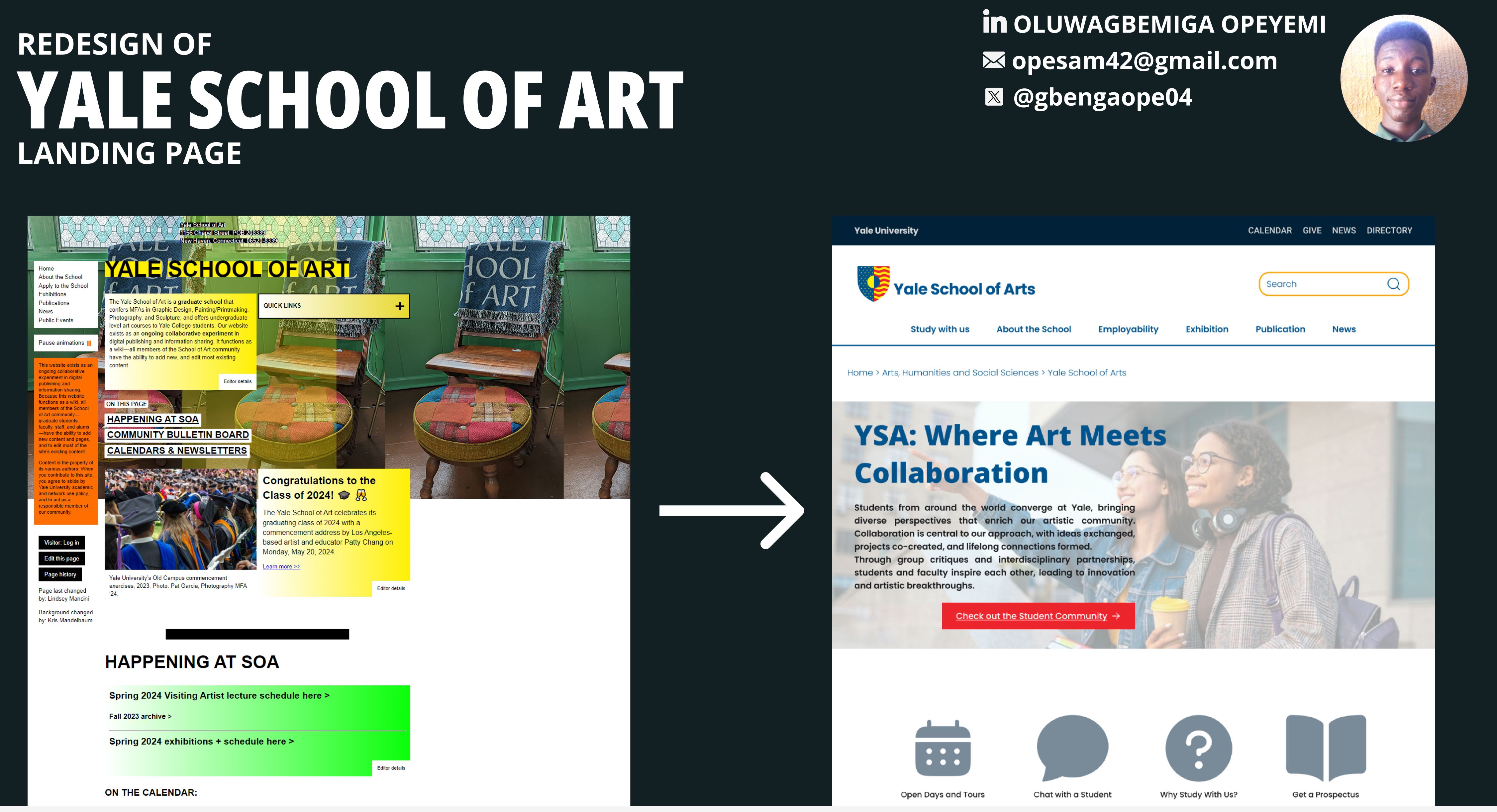
After completing a UX course from the University of Michigan on Coursera, I wanted to put my newly acquired knowledge into practice. With a background in UI design and graphic design, I decided to find a real-world problem that I could tackle using the UX heuristics I had learned. During my search, I discovered the Yale School of Art website, a surprisingly awkward design for such a prestigious institution. Though this design was intentional, functioning as a community-editable wiki, I saw an opportunity to redesign the site and make it more aesthetically pleasing and user-friendly.
Design Process
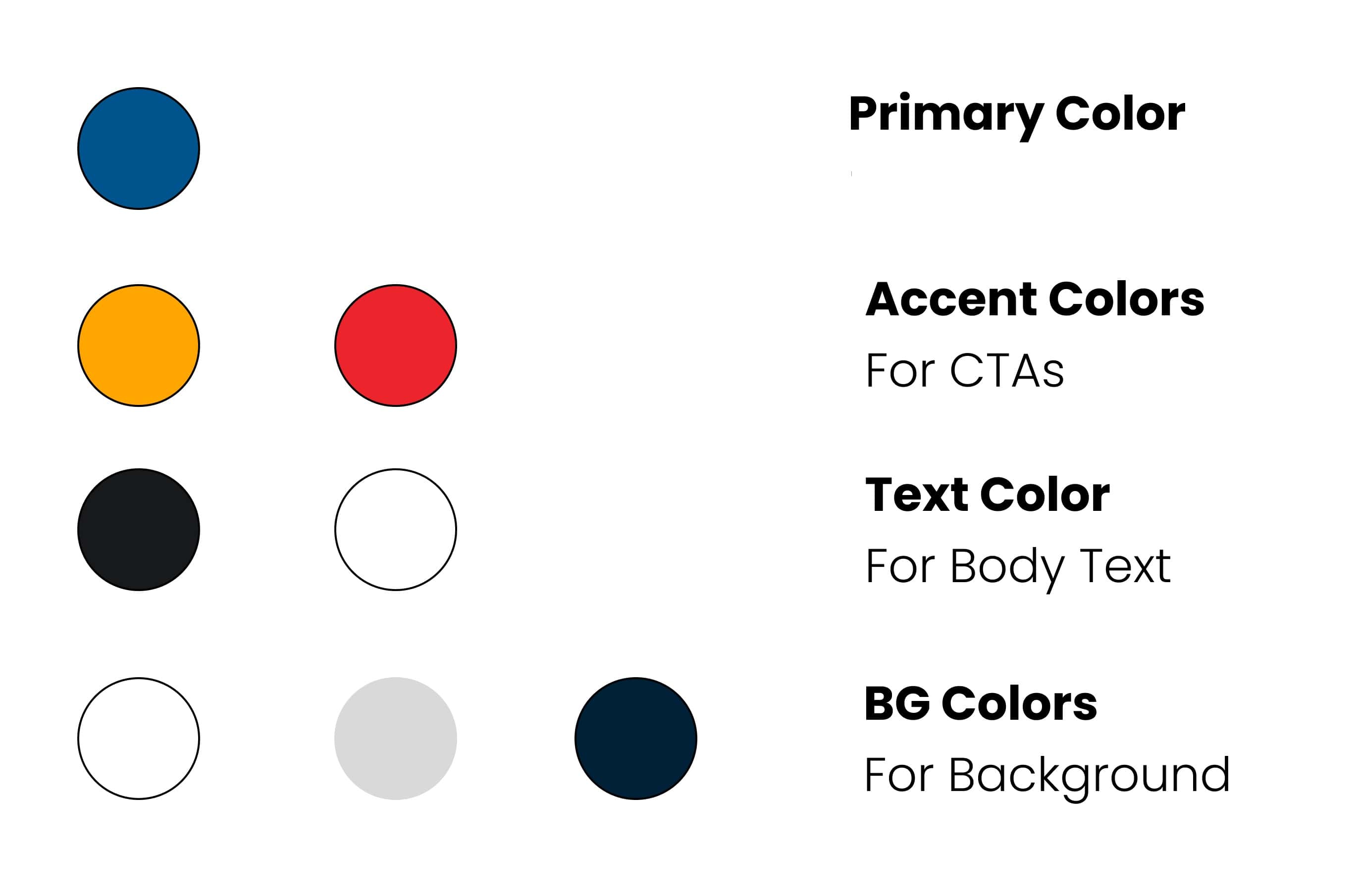
The redesign process was applying UX principles and leveraging my skills in Figma.
- Inspiration & Competitor Analysis: I began by analyzing the websites of other art institutions in the US and UK. I found that many US art schools had design issues, but Lancaster and Cambridge School of Art stood out for their clean, functional design, which I used as my guide.
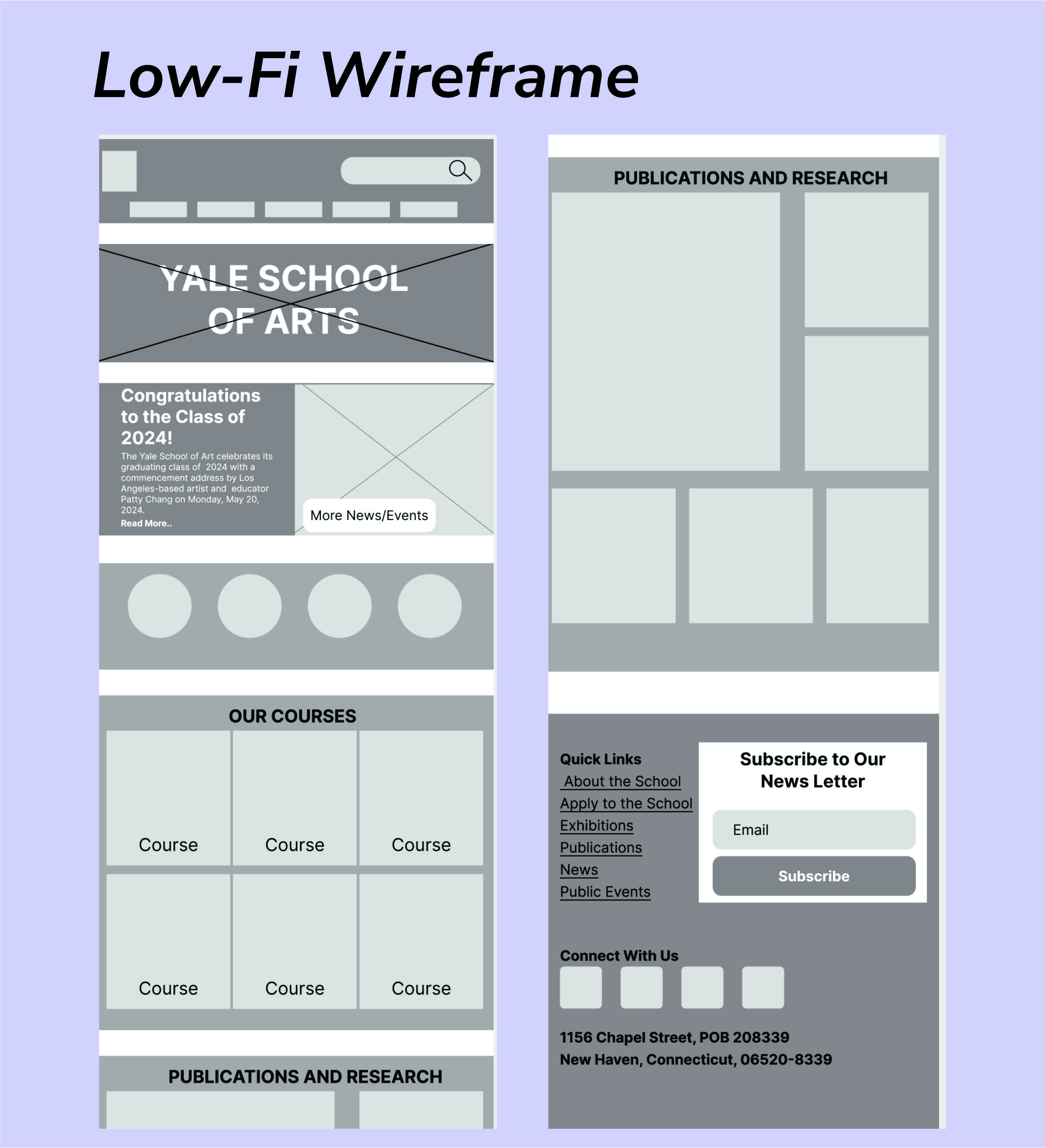
- Wireframing: Using Figma, I sketched out wireframes to establish a clean and intuitive structure. My focus was to reduce clutter, improve navigation, and highlight key sections like news, upcoming events, and student work.
Development
Tools: HTML, Tailwind CSS and JavaScript
Visit the webpage: opesam42.github.io/yale
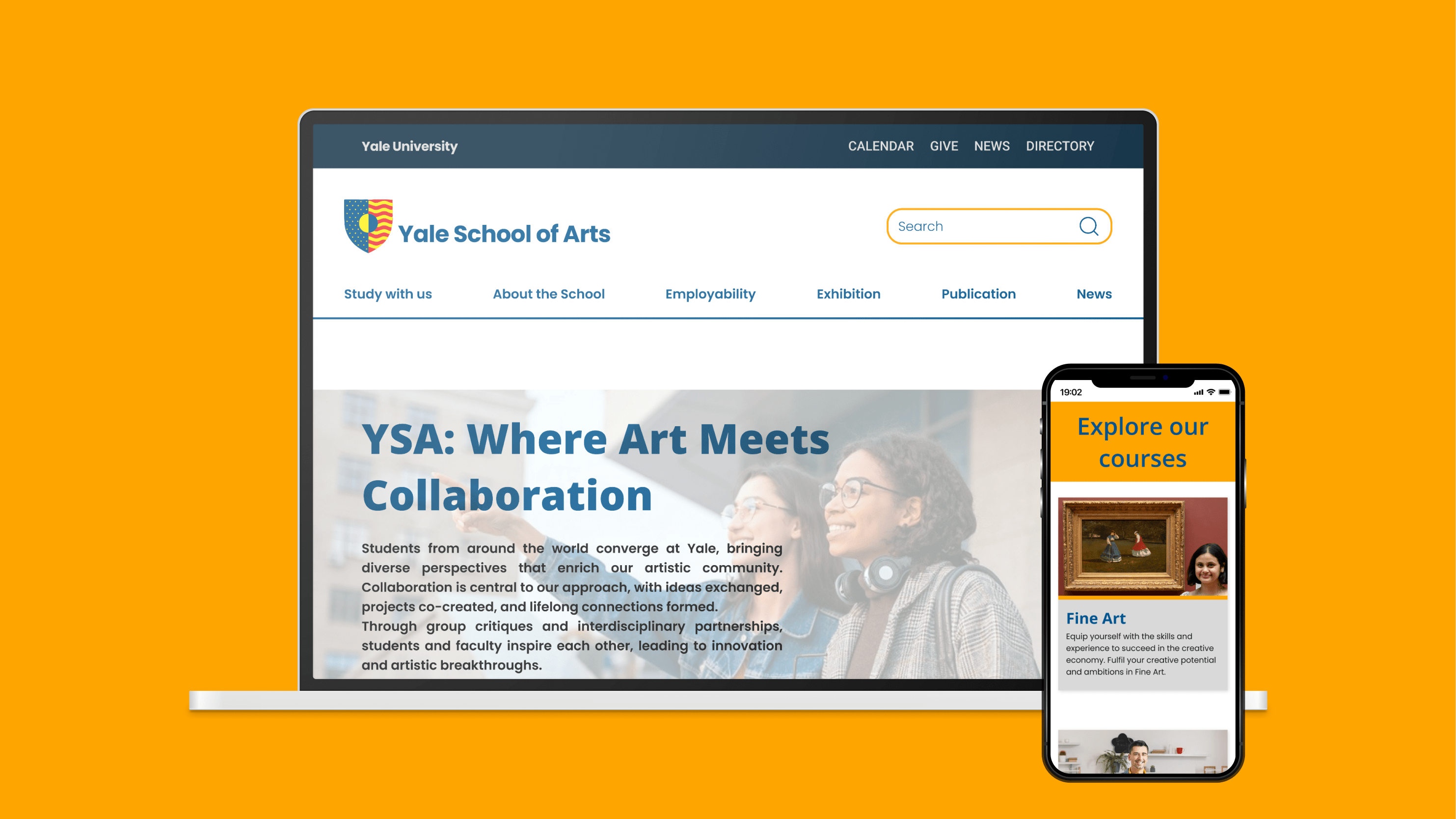
Solution & Results
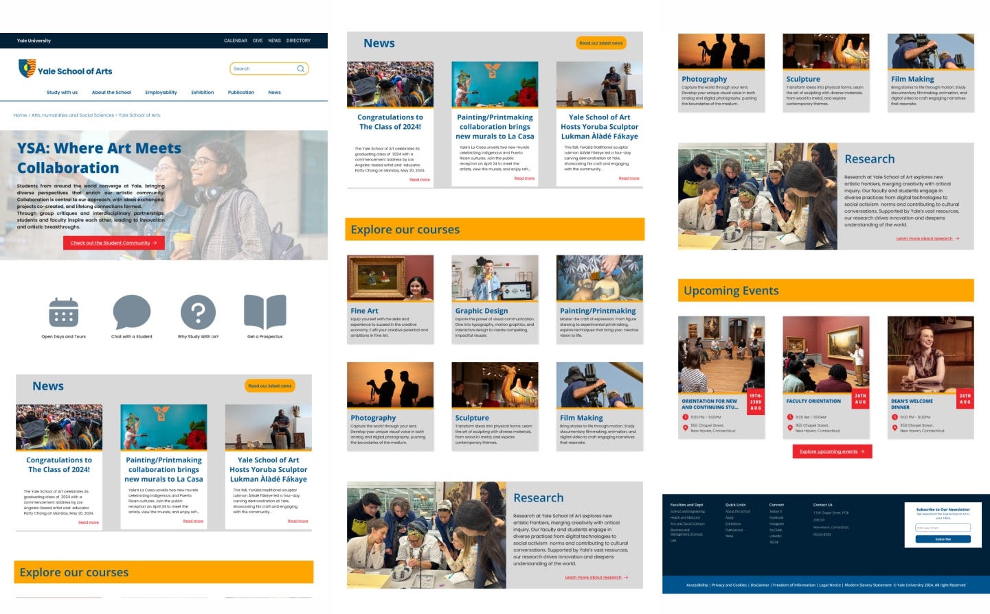
The final design of the Yale School of Art homepage addressed the key issues I had identified:
- Cleaner Visual Design: The redesign was structured and visually appealing, using a consistent color scheme, clean typography, and cohesive layouts.
- Improved Navigation: The homepage featured clear navigation, helping users quickly find key sections such as events, news, and student work.
- Enhanced Usability: By reducing clutter and simplifying the interface, the site became more intuitive, creating a better user experience.
Though this was a personal project, it allowed me to apply real-world UX practices and improve my design and research skills.