
ZEPAMA
Overview
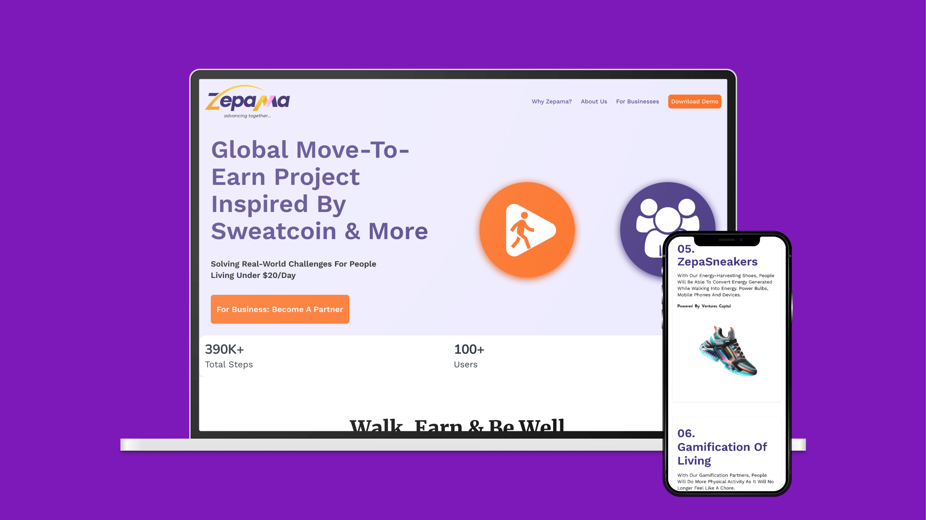
ZEPAMA is a Move-to-Earn initiative inspired by platforms like Sweatcoin in Nigeria. Its mission is to tackle real-world challenges faced by individuals living on less than $20 a day, offering them an opportunity to earn rewards through physical activity. With innovative features like ZepaPoints, ZepaCoins, and ZepaEnergy, as well as wearables like ZepaWatches and ZepaSneakers, Zepama gamifies fitness to incentivize healthier lifestyles.
For their pitch competition organized by ONDEA, I was tasked with redesigning their landing page to better communicate the idea, improve user engagement, and drive interest in the app.
- Role: UI/UX Designer and Web Designer (Solo)
- Duration: 3 days
- Design Tool(s): Figma
- Development Tool(s): HTML, CSS and Vanilla JavaScript
Design Process
There was already a design file meant for the landing page, but it had a lot of design problems. The page was cluttered with excessive brand colors and lacked a compelling flow to explain how Zepama addresses the real-world problems of underprivileged communities. Furthermore, the app demo and partner opportunities were not prominently displayed, which diminished the startup's appeal to both users and investors. To solve that, I refined the design by:
- Reducing the overuse of brand colors and streamlining the color palette to ensure consistency.
- Incorporating custom icons that clearly represent the core features of the app, improving the overall communication of the product.
- Revamping the features section with brief, digestible text and icons to explain the app’s benefits.
- Creating an interactive app demo showcase section to help users visualize the app’s functionality.
Development
I converted the design into a static landing page using HTML, CSS, and JavaScript, ensuring the website was fully responsive across devices and optimized for speed.
Solution & Results
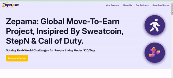
The final design was a polished and professional landing page that conveyed Zepama’s mission to revolutionize how people earn through physical activity. Key improvements included:
- Clear Messaging: The redesigned layout highlighted essential features providing a clear explanation of how the app rewards users.
- Engaging Visuals: The app demo and wearable technology sections were visually showcased, helping users and investors better understand Zepama's value.
- User-Friendly Navigation: Simplified navigation ensured potential partners and users could easily find key information, including details on life insurance, partner programs, and gamification.
The landing page, combined with the eloquence of the presenter, was instrumental in Zepama winning the ONDEA pitch competition.